Your next presentation could change everything. How you present matters just as much as what you present. Great visual communication can turn a good message into an unforgettable experience.
This guide will help you master slide creation from the ground up. You’ll learn practical design principles that transform ordinary slides into powerful engagement tools. We’ll explore strategic visual storytelling that drives your message home.
We’ll cover color psychology, layout techniques, typography choices, and animation best practices. You’ll gain the skills to create attention-grabbing presentations that deliver results. Let’s transform your ideas into visual experiences that stick.
Key Takeaways
Effective slide design combines visual elements with clear messaging to maximize audience impact and retention
Professional presentation slides require understanding of core design principles like contrast, alignment, and hierarchy
Strategic use of color, typography, and whitespace dramatically improves communication effectiveness
Slide creation is both an art and a science that anyone can learn with the right techniques
Quality visual design enhances credibility and helps your audience remember your key messages
This comprehensive guide provides actionable strategies for creating presentations that truly resonate
Understanding the Importance of Slide Design
Poor slides can make audiences lose focus. Well-designed slides cut through information overload and make your message stick. Your presentation’s success often depends on slide quality.
Good slides turn abstract ideas into concrete visuals. They help your message last long after your talk ends.
How Visuals Transform Your Message
Our brains process images 60,000 times faster than text. Wired to process visual information at remarkable speeds, our minds quickly grasp complex ideas through visuals.
Charts and graphs help audiences see patterns instantly. A good visual can explain more quickly than paragraphs of text.
Strategic visuals transcend language limitations. They make content accessible to diverse groups. Visuals create understanding where words might fall short.
Effective slides also create emotional connections. Colors and images trigger feelings that reinforce your message. Combining visuals with strong content creates impactful presentations.
The Power of Beautiful Design
Aesthetics drive engagement and retention. People form opinions about visuals within 50 milliseconds. Your design choices determine if audiences stay engaged.
Clean layouts show professionalism. Good color schemes help viewers focus. Thoughtful typography improves readability and keeps people engaged.
Cluttered slides overwhelm viewers. Clashing colors create visual stress. Every design decision either builds trust or erodes it.
People remember visual information better than text-only content. Pairing key points with relevant imagery increases recall rates. Audiences remember both your message and the presentation experience.
Design Element
Effective Approach
Impact on Audience
Common Mistakes
Visual Hierarchy
Clear focal points with strategic sizing and placement
Guides attention to key messages, improves comprehension by 73%
Equal emphasis on all elements, creating confusion
Color Usage
Limited palette (3-4 colors) with intentional contrast
Enhances mood, increases brand recognition by 80%
Rainbow slides with competing colors that distract viewers
Content Density
One main idea per slide with minimal text
Reduces cognitive overload, boosts retention by 65%
Paragraphs of text that audiences can’t read and listen simultaneously
Image Quality
High-resolution, relevant visuals that support messaging
Builds credibility, increases perceived professionalism by 94%
Pixelated stock photos or irrelevant decorative images
These principles change how you create presentations. Good slide design is about strategic communication that respects your audience’s time and attention. Every visual choice affects perception, engagement, and memory.
You now understand why design matters. Next, explore techniques to make your slides extraordinary. Remember, engaging slides help your message create lasting impact.
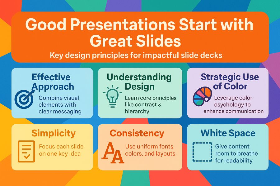
Principles of Effective Slide Design
Effective slides follow proven principles that transform presentations into memorable experiences. These principles serve as a roadmap from amateur attempts to effective slides that resonate with your audience. They provide a framework for making smart decisions when creating presentations.
These principles are simple to apply. You don’t need advanced design skills or expensive software. What you need is awareness of what makes slides work.
Think of these principles as the foundation of your presentation house. With these core concepts, your message gains the clarity and impact it deserves.
The Power of Simplicity
Simplicity is the cornerstone of professional slide design. When you limit details, your audience remembers your message better. One key idea per slide amplifies your impact.
Many presenters treat slides as speaker notes or documents. This approach overwhelms viewers and competes with your spoken words. Your slides should complement what you say, not duplicate it.
Your slides work like room decor. The main message should jump out immediately, supported by minimal visual elements.
Limit text to 5-7 words per line and no more than 6 lines per slide. Replace paragraphs with single powerful statements. Use one compelling image rather than multiple competing visuals.
Each slide should pass the “glance test.” If someone can’t grasp your main point in 3 seconds, simplify it. This forces you to distill complex information into its essence.
Building Consistency Across Your Presentation
Consistency ties your entire presentation together. Uniform fonts, colors, and layouts build professional credibility without your audience realizing why they trust you more.
Consistency reduces cognitive load. Viewers shouldn’t spend energy adjusting to new design patterns on every slide. They should focus entirely on your content and message.
Select two fonts maximum—one for headings and one for body text. Stick with these throughout your presentation. This eliminates visual chaos before it begins.
Choose 2-3 primary colors and use them consistently for similar elements. Headings should always appear in the same color. Call-out boxes should maintain identical styling from slide to slide.
Layout consistency matters equally. Keep logos in the same position on all slides. Position headings at the same height. Maintain consistent margins and spacing.
This consistency creates a reliable visual framework for your ideas. Think of it as the stage upon which your content performs.
Harnessing the Impact of White Space
White space is often misunderstood in slide design. Many rush to fill empty areas, creating cluttered slides. This approach backfires, frustrating viewers instead of informing them.
White space isn’t wasted—it’s working hard. It directs attention and creates breathing room for easier processing. Luxury brands use white space to convey sophistication and confidence.
Strategic white space improves readability dramatically. Text with adequate spacing gets read and remembered more often. Your key messages deserve room to make their impact.
White space establishes visual hierarchy naturally. Elements with more space around them seem more important. You can guide viewers through content using thoughtful spacing.
Embrace margins generously. Leave at least 10-15% of your slide empty around the edges. Maintain consistent spacing between elements. Don’t fear empty areas—they’re your allies in creating compelling slides.
Design Principle
Common Mistakes
Best Practices
Expected Outcome
Simplicity
Cramming multiple ideas onto one slide; using full sentences and paragraphs
One key concept per slide; 5-7 words per line; maximum 6 lines of text
Audience grasps main message in 3 seconds; improved retention and engagement
Consistency
Changing fonts, colors, and layouts randomly; inconsistent element positioning
Use 2 fonts maximum; maintain 2-3 color palette; uniform spacing and alignment
Professional appearance; reduced cognitive load; stronger audience trust
White Space
Filling every available area; minimal margins; crowded layouts
Maintain 10-15% empty margins; generous spacing between elements; strategic negative space
Enhanced readability; clear visual hierarchy; modern and sophisticated look
These design fundamentals work together synergistically. Simplicity determines what to include, consistency governs presentation, and white space ensures easy consumption. Master these principles to create attention-commanding, results-driving presentations.
Choosing the Right Slide Format
Selecting the right slide format is crucial for your presentation’s success. It affects slide design and audience experience. Making the right choice saves time and prevents formatting headaches later.
Technical aspects of slide format are important for proper display across devices. Informed choices ensure your work looks professional in every setting.
Know Your Platform Options
Your chosen presentation software shapes your creative process. PowerPoint slides are the industry standard, offering robust features and wide compatibility.
Google Slides is popular for its collaboration features and cloud-based accessibility. Work with team members in real-time and access slides from any device.
Apple’s Keynote provides stunning visuals with smooth transitions and elegant templates. It’s ideal for Mac users who want polished slides with minimal effort.
Prezi offers a non-linear, zooming canvas format. Navigate across a single large canvas instead of individual slides. It’s great for showing relationships between concepts.
Canva bridges design and presentation with a user-friendly interface. Its extensive template library helps create visually appealing slides quickly, even without design experience.
Linear formats work best for step-by-step explanations and formal business presentations. Non-linear formats excel at exploring interconnected ideas and creating conversational presentations.
Consider whether your slides will support a live presentation or stand alone. Live presentation slides can be simpler. Standalone slides need more detailed text and self-explanatory visuals.
Understanding Slide Dimensions
Slide dimensions affect how your content displays on different screens. Aspect ratio determines the width-to-height proportion of your slides.
The 4:3 aspect ratio matches older projection systems and monitors. It’s less common today but still used in some educational institutions.
The widescreen 16:9 ratio is now the modern standard. It matches contemporary displays and provides more horizontal space for visual impact.
Check your speaking location’s equipment before finalizing your slides. Using the wrong aspect ratio can result in awkward black bars or cropped content.
Distribution method also influences dimension decisions. Slides shared online typically work best in 16:9 format. Social media platforms have specific dimension requirements for presentation content.
Format Type
Aspect Ratio
Pixel Dimensions
Best Use Cases
Standard
4:3
1024 × 768
Academic settings, older venues, printed handouts
Widescreen
16:9
1920 × 1080
Modern conferences, corporate presentations, online sharing
Ultra-wide
16:10
1920 × 1200
Mac displays, design presentations, creative projects
Social Media
1:1 or 9:16
1080 × 1080 or 1080 × 1920
Instagram, LinkedIn posts, mobile-first content
Starting with the correct slide format builds a solid foundation for your presentation. Research your presentation environment and choose dimensions that ensure perfect display.
Consider creating multiple versions of your presentation in different formats. Many presenters maintain both 4:3 and 16:9 versions of important slide decks.
Selecting Color Schemes for Slides
Colors can turn ordinary slides into unforgettable visual experiences. They influence emotions, reinforce your message, and keep your audience engaged. Mastering color use sets professional presentations apart from amateur ones.
Many presenters choose colors based on personal preference or brand guidelines. This approach misses a chance to enhance communication and create lasting impressions. Understanding color psychology and harmony gives you a powerful advantage in presentation design.
How Colors Influence Your Audience
Different colors trigger specific emotional and behavioral responses in viewers. Knowing these associations helps you make intentional choices that strengthen your message. Blue stands as the most popular choice for corporate presentations because it conveys trust and professionalism.
Red creates urgency and excitement, perfect for call-to-action moments. Green suggests growth and environmental consciousness, ideal for sustainability or financial presentations. Yellow radiates optimism but can strain eyes when overused.
Purple communicates creativity and luxury, while orange combines energy with friendliness. Black projects sophistication and authority. Each color should serve a specific purpose aligned with your goals.
Cultural context is crucial when selecting colors, especially for international audiences. White symbolizes purity in Western cultures but represents mourning in some Asian countries. Research your audience’s background to ensure your color choices support your message.
Color
Emotional Impact
Best Use Cases
Cultural Considerations
Blue
Trust, calm, professionalism
Corporate presentations, financial reports, healthcare
Universally positive across most cultures
Red
Urgency, passion, energy
Sales presentations, warnings, calls-to-action
Luck in Asia, danger in Western contexts
Green
Growth, harmony, freshness
Environmental topics, finance, wellness
Generally positive, nature associations worldwide
Orange
Enthusiasm, creativity, warmth
Creative pitches, educational content, technology
Spiritual significance in some Eastern cultures
Purple
Luxury, wisdom, imagination
Premium products, creative industries, education
Royalty in Western cultures, mourning in some regions
Building Beautiful Color Combinations
Creating harmonious color schemes requires understanding proven color theory principles. The 60-30-10 rule provides a foolproof framework for color distribution. Use your main color for 60%, secondary for 30%, and accent for 10%.
Complementary colors are opposite on the color wheel, creating high contrast. Analogous colors are next to each other, producing calming effects. Triadic combinations use three evenly spaced colors for vibrant contrast.
Digital tools like Adobe Color and Coolors simplify creating professional slide palettes. They ensure your color choices work together mathematically and aesthetically.
Accessibility considerations must guide your color decisions to ensure all audience members can view your content. Keep a contrast ratio of 4.5:1 between text and background colors for readability. About 8% of men have color blindness.
Test your colors using colorblind simulators to verify important distinctions remain visible. Don’t use red and green as the only differentiators in charts. Add patterns or labels to ensure everyone understands.
Start with three to five colors maximum to maintain visual consistency. Too many colors create chaos and weaken your message. Use brand colors as a base, adding harmonious supporting colors.
Crafting Compelling Content for Slides
Aesthetics draw people in, but words and ideas keep them engaged. Beautiful design is the vehicle. Compelling slides need substance that connects with your audience.
Creating powerful slide content needs strategic thinking. It’s about what to include, what to leave out, and how to structure your message. Your content should work with visuals to create a memorable experience.
Keep Your Key Messages Clear
Clarity makes slides effective. Each slide should communicate one central idea supporting your overall goal. Focusing on one point per slide improves comprehension.
Your audience can only process so much at once. Give people time to absorb your message before moving forward.
Use headlines that capture attention immediately. Think of them as newspaper titles conveying the main point at a glance. Try specific statements instead of generic labels.
Avoid using slides as speaker notes. Your audience shouldn’t read paragraphs while you’re presenting. This creates a disconnect that undermines your entire presentation.
Effective Slide Content
Ineffective Slide Content
Impact on Audience
Clear headline with supporting visual
Long paragraphs of text
Quick comprehension vs. reading fatigue
One key concept per slide
Multiple unrelated points crammed together
Focused attention vs. confusion
Action-oriented language
Passive, vague statements
Engagement vs. disinterest
Minimal text with strong visuals
Text-heavy slides with weak images
Visual memory vs. information overload
Each slide should serve a clear purpose in your narrative. Ask yourself: “What should my audience remember from this?” If you can’t answer quickly, refine the slide.
Harness the Power of Storytelling
Stories activate multiple brain regions, creating deeper engagement than facts alone. They transform dry information into memorable narratives. These resonate emotionally with your audience.
Identify the narrative arc of your presentation. Every good story has a beginning, middle, and end. Your presentation content should follow this structure to maintain interest throughout.
Consider these proven story structures for presentations:
- Problem-Solution-Benefit: Present a challenge your audience faces, introduce your solution, then highlight the positive outcomes
- Before-After-Bridge: Show the current situation, paint a picture of the improved future, then explain how to get there
- Hero’s Journey: Position your audience as heroes who overcome obstacles with your guidance
Real anecdotes and case studies bring your points to life. Share a specific customer’s journey instead of stating “Customer satisfaction improved”. Human stories create emotional connections that statistics cannot match.
Create narrative flow between your slides using transitions that connect ideas. Each slide should naturally lead to the next. Avoid random jumps between topics that break the story’s rhythm.
Balance data with narrative elements in your slides. Numbers provide credibility, but stories provide meaning. Wrap statistics in context that explains why they matter to your audience.
Use Bullet Points Wisely
Bullet points are often misused in slide design. Overreliance on bullets creates monotonous slides that fail to engage viewers. Use them only for listing distinct items that don’t need lengthy explanation.
Limit bullets to three to five points maximum per slide. Beyond five items, your audience struggles to remember the information. Break longer lists across multiple slides or reconsider their necessity.
Keep bullet text concise—aim for single lines rather than multi-line entries. Each bullet should represent a complete thought in as few words as possible. Remove unnecessary words to tighten your message.
Consider alternatives to traditional bullet points that add visual interest:
- Numbered lists when sequence matters
- Icon-based layouts where each point gets a visual symbol
- Comparison columns for contrasting ideas
- Timeline formats for chronological information
Use progressive reveal techniques to keep attention focused. Animate bullets to appear as you discuss each item. This prevents your audience from reading ahead and ensures they follow your narrative pace.
Challenge yourself to find more engaging formats when bullets aren’t working. Could your list become an infographic? Would a diagram communicate the relationships better? Sometimes the best slides don’t use bullets at all.
Remember, slides should enhance your spoken words. They provide visual anchors that help your audience follow along. Good slides help people remember key takeaways long after your presentation ends.
Incorporating Imagery in Your Slides
Well-chosen visuals enhance understanding and create lasting impressions. They transform complex ideas into digestible concepts. The right slide imagery makes your message more powerful and memorable.
Visual elements should support your core message. Choosing the right images helps you communicate more effectively.
Choosing the Right Visual Elements
Photographs establish authenticity and emotional resonance. They create trust and help audiences connect personally. Use photos for team members, customer testimonials, or real-world applications.
Illustrations represent abstract concepts that don’t exist physically. They’re ideal for explaining theoretical ideas or showing future possibilities. Custom illustrations help your presentation stand out from generic stock photos.
Icons simplify complex ideas into recognizable symbols. They create visual consistency and help audiences grasp key concepts quickly. Icons work well for process steps, feature lists, and navigation elements.
Diagrams and infographics transform data relationships and processes into understandable visuals. Use them for explaining workflows, organizational structures, or cause-and-effect relationships. These graphics make complicated information accessible at a glance.
Charts and graphs present numerical data to reveal patterns and trends. Bar charts compare values, line graphs show changes over time. Choose the chart type that best highlights your data story.
Full-bleed images create dramatic impact by extending across your slide. They work well for section dividers or opening slides. Ensure text remains readable by adjusting contrast or adding subtle overlays.
Image overlays with text combine powerful visuals with your message. Adjust photo portions to ensure text legibility. This technique creates professional-looking slides that balance aesthetics with functionality.
Image combinations tell richer visual stories than single photos. Pair before-and-after shots or show multiple perspectives of the same concept. Maintain balance to avoid visual chaos on your slides.
Avoid clichéd stock photos that audiences have seen countless times. Skip staged handshakes or forced corporate smiles. Seek authentic moments that reflect real experiences.
Finding Quality Visual Resources
Quality visuals don’t require a massive budget. Many platforms offer excellent images that elevate your slides affordably. Know where to find these resources and how to use them legally.
Free stock photo platforms like Unsplash, Pexels, and Pixabay provide professional images at no cost. They offer generous licenses that typically allow commercial use without attribution.
Unsplash specializes in artistic, high-resolution photography. Pexels combines photos and videos with an easy search interface. Pixabay offers illustrations and vector graphics alongside photos.
Premium stock services like Shutterstock and Adobe Stock offer specific concepts and exclusive content. They provide refined search tools, broader selections, and images unavailable on free sites.
Paid platforms make sense for client presentations or published work. They offer licensing clarity and peace of mind for professional projects.
Understanding Creative Commons licensing prevents legal issues. Always check usage rights before downloading. Some images require attribution, others prohibit commercial use.
Keep a record of image sources and attribution requirements. This documentation proves invaluable if questions arise about usage rights later.
Image quality considerations affect how professional your slides appear. Aim for at least 1920×1080 pixels for standard presentations. Low-resolution images appear pixelated and unprofessional when projected.
File formats affect quality and size. JPEGs work well for photographs, PNGs preserve transparency. SVG files scale perfectly for icons and simple illustrations.
Basic editing skills enhance your visuals significantly. Crop images, adjust brightness, and apply subtle filters for consistency. Free tools like Canva or PowerPoint’s built-in editor handle most basic adjustments.
Image Source
Cost
Best For
License Type
Image Quality
Unsplash
Free
Artistic photos, modern aesthetics
Free to use, no attribution required
High resolution, professional
Pexels
Free
Diverse photos and videos
Free to use, attribution appreciated
High quality, varied styles
Pixabay
Free
Photos, illustrations, vectors
Free to use, some restrictions
Good quality, mixed sources
Shutterstock
Paid subscription
Specific concepts, exclusive content
Royalty-free with subscription
Premium, consistent quality
Adobe Stock
Paid per image or subscription
Professional projects, Adobe integration
Standard or enhanced license
Premium, curated collection
Strategic selection and proper sourcing of slide graphics creates compelling visual experiences. Choose image types that match your message. Source them responsibly to create slides that inform, engage, and inspire.
Enhancing Slide Interactivity
Interactive slides can transform a forgettable presentation into a memorable one. They create a two-way conversation, keeping people alert and increasing information retention. This approach makes your message stick long after the presentation ends.
Interactive elements change how your audience processes information. People remember 65% more information when they actively participate compared to passive viewing. Choose the right interactive features to enhance your message without creating distractions.
Interactive Tools That Transform Your Presentations
Modern presentation tools offer built-in features to make your slides more dynamic. PowerPoint, Keynote, and Google Slides include animation and transition capabilities that respond to clicks. You can create reveal effects where information appears progressively, helping your audience focus.
Hyperlinks add another dimension to your presentations. You can create clickable navigation to jump to different sections based on audience interest. This non-linear approach works well for sales presentations or teaching scenarios.
Embedded videos and audio clips bring multimedia richness to your slides. This seamless integration maintains momentum and keeps your audience focused on your content. It avoids switching between applications, which can be distracting.
Mentimeter enables live polling where audience members vote using their smartphones. Results appear instantly on your slides, creating excitement and providing valuable insights. This real-time feedback tool is great for engaging large groups.
Slido integrates Q&A functionality directly into your presentation. Attendees can submit questions as you speak and upvote the most interesting ones. You can address popular queries without losing track, making it ideal for large audiences.
Kahoot turns learning into a game, perfect for educational or training contexts. You can create interactive quizzes that challenge your audience to answer questions quickly. The competitive element increases engagement and helps reinforce key concepts through active recall.
Prezi offers a zoom-based navigation approach instead of linear slide progression. You can create a visual canvas where you zoom in and out of topics. This spatial organization helps audiences understand relationships between concepts and see the big picture.
Advanced tools now support interactive data visualizations that respond to user input. You can embed charts where viewers adjust parameters to see different scenarios. Some presentations even incorporate augmented reality elements that blend digital content with the physical environment.
Tool Name
Primary Function
Best Use Case
Learning Curve
Mentimeter
Live polling and word clouds
Gathering instant audience feedback
Easy
Slido
Q&A and discussion management
Large conferences or webinars
Easy
Kahoot
Interactive quizzes and games
Training sessions and education
Moderate
Prezi
Zoom-based non-linear navigation
Conceptual presentations with complex relationships
Moderate
PowerPoint Live
Real-time subtitles and translation
Multilingual or accessibility-focused presentations
Easy
Creating Genuine Connections With Your Viewers
Technology provides the tools, but audience engagement requires strategic thinking about involving people. The goal is to deepen understanding and create memorable moments that reinforce your key messages. It’s not about adding interactivity for its own sake.
Identify natural participation points in your presentation flow. After introducing a complex concept, pause for a quick poll to gauge understanding. Before revealing your solution, ask the audience to predict the outcome.
Balance is crucial for engaging presentations. Too much interactivity can fragment your narrative, while too little leaves your audience drifting. Aim for one interactive element every five to seven minutes in a standard 30-minute presentation.
Consider how your slides will function in different contexts. Include interactive features that work without a presenter for standalone viewing. Clickable navigation, embedded videos with controls, and progressive disclosure animations work well in this scenario.
Interactive elements are effective because they create personal investment in the content. This active participation triggers stronger memory formation compared to passive observation. Your audience shifts from asking “What is the presenter telling me?” to “What do I think about this?”
Design interactive moments to accommodate different participation styles. Offer multiple ways to engage, such as voting, typing questions, or physical interaction. This ensures everyone can contribute in ways that feel comfortable.
Test your interactive features before the actual presentation. Have a backup plan for every interactive element in case of technical glitches. This could be a discussion question or printed materials if digital tools fail.
Simple interactions can be just as powerful as sophisticated presentation tools. A well-timed question or a moment of paired discussion can be highly effective. The technology should enhance human connection, not replace it.
Best Practices for Presentation Delivery
Stunning slides are just the beginning. Your delivery determines how well your message connects with the audience. These tips will help you present professionally with confidence.
Practice Makes Perfect
Rehearsing is crucial for successful presentations. Run through your slides multiple times before the event. Time yourself to stay on schedule.
Practice with the actual equipment you’ll use. Speak your content out loud instead of reading silently. This preparation builds confidence and helps you transition smoothly between slides.
Getting Input Before You Present
Test your slides with a small group beforehand. Ask colleagues to review your content and design choices. Listen to their suggestions and make adjustments to strengthen your message.
Fresh eyes often spot issues you might have missed. Their feedback can greatly improve your presentation’s effectiveness.
Managing Questions Effectively
Prepare for questions by anticipating what your audience might ask. Create backup slides with extra data you can reference if needed.
Stay calm when handling tough questions. Keep your responses brief and focused. If you don’t know an answer, be honest and offer to follow up later.
Show respect for every question while maintaining control of the conversation. This approach demonstrates professionalism and enhances your credibility.
FAQ
How many bullet points should I include on a single slide?
Use 3-5 bullet points per slide for clarity. Keep each bullet concise, ideally one line long. Support a single key idea with each bullet point.If you need more bullets, split your content across slides. Slides should highlight key takeaways, not be speaker notes.
What’s the best aspect ratio for presentation slides: 4:3 or 16:9?
The 16:9 widescreen format is the modern standard. It works best with newer projectors and displays. This format provides more horizontal space and looks professional.However, 4:3 might be safer for older venues or printed handouts. Consider your presentation equipment beforehand. When unsure, choose 16:9 for versatility.
Where can I find free, high-quality images for my slides?
Unsplash, Pexels, and Pixabay offer free, professional-quality images without licensing fees. These platforms provide diverse imagery for various presentation types.Check specific licensing terms before use. It’s good practice to credit photographers when possible. Avoid overused stock photos and choose authentic images.
How can I make sure my slides are accessible to colorblind viewers?
Ensure high contrast between text and background colors. Aim for a contrast ratio of 4.5:1 for regular text. Use patterns, textures, or icons alongside color coding.Avoid problematic color combinations like red-green or blue-yellow. Use tools like Adobe Color for colorblind-safe palettes. Test your slides with colorblindness simulators.
Should I use animations and transitions in my presentation?
Use animations and transitions sparingly and purposefully. They should enhance understanding, not distract from your message. Simple transitions like fade or dissolve work best.Animations are effective for revealing bullet points or showing processes step-by-step. Avoid automatic animations. Consistency is key—use the same transition style throughout.
How much text should I put on each slide?
Follow the “one slide, one idea” principle. Use no more than 6-8 words per line and 6-8 lines per slide maximum.Your slides should support your speech, not repeat it. Think of text as headlines or key takeaways. Audience should grasp the main point in 3 seconds.
What fonts work best for presentation slides?
Choose clean, sans-serif fonts like Helvetica, Arial, or Calibri for readability. Use a minimum font size of 24-30 points for body text.Stick to one or two font families throughout your presentation. Use bold or increase size to emphasize points rather than multiple font styles.
How do I create a cohesive color scheme for my slides?
Select a primary color that aligns with your brand or topic. Use the 60-30-10 rule: 60% dominant color, 30% secondary, 10% accent.Limit your palette to 3-4 colors maximum. Consider your presentation environment when choosing background colors. Test your colors together for harmony.
Is it better to design slides for live presentation or standalone viewing?
Design primarily for your intended use. Live presentation slides should be minimal, supporting your verbal delivery. Standalone slides need more complete information.Consider creating two versions if needed: minimal for presenting and expanded for distribution. Use the “notes” feature to add context without cluttering slides.
How can I make data-heavy presentations more visually engaging?
Transform raw data into visual stories using charts, graphs, and infographics. Choose the right chart type for your data. Highlight important points with color or callouts.Break complex data across multiple slides. Use icons and visual metaphors to represent statistics memorably. Tools like Power BI can help create compelling visualizations.
What’s the ideal number of slides for a presentation?
A common guideline is one slide per minute of presentation time. For a 20-minute talk, aim for about 20 slides.Focus on pacing and content rather than hitting a specific slide count. The 10/20/30 rule suggests 10 slides, 20 minutes, 30-point minimum font.
How do I maintain consistency across all my slides?
Use master slides or templates to establish consistent layouts, fonts, and colors. Define style choices once in the master slide.Keep font choices limited to 1-2 families. Use the same color palette throughout. Create a style guide document for your presentation.
Should I include my company logo on every slide?
Place your logo on the title slide and optionally on the final slide. Avoid putting it on every slide unless required.If needed throughout, make it small and position it consistently. For external presentations, more frequent logo use might be necessary.
How can I effectively rehearse my presentation?
Practice your presentation out loud multiple times. Time yourself to ensure you fit within your allotted duration. Rehearse with your actual slides using presenter mode.Practice in front of a mirror or record yourself. Present to colleagues for feedback. Familiarize yourself with the venue and equipment beforehand.
What should I do if I need to present in a language that’s not my first language?
Keep your slides simple and visual when presenting in a non-native language. Use clear, straightforward language and avoid complex expressions.Write out and practice your key talking points. Add slightly more text to slides than usual. Speak slowly and clearly.