You’ve been using Whisk AI wrong. And you probably don’t even know it.
Most Whisk AI users follow the same routine: upload three images — a subject, a scene, a style — click generate, and accept whatever comes out. When the result looks mediocre, they blame the AI. When it looks broken, they regenerate and hope for better luck.
But luck has nothing to do with it. After analyzing hundreds of Whisk AI generations across different use cases, a clear pattern emerges: the same five mistakes appear in roughly 9 out of 10 user workflows. Fix these mistakes, and your output quality jumps from “interesting experiment” to “genuinely useful creative asset.”
The worst part? Every single one of these mistakes is easy to fix — once you know what you’re doing wrong.
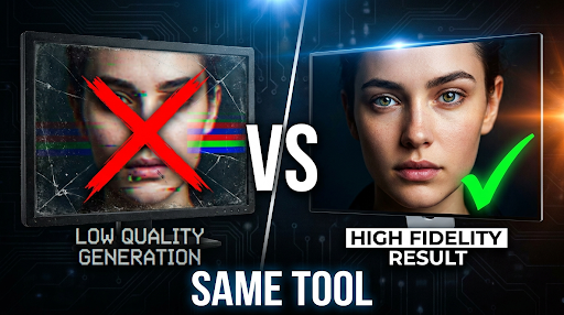
Mistake 1: Using Low-Resolution or Cluttered Input Images
This is the most common mistake, and the most damaging.
Whisk AI’s visual remixing system works by analyzing your uploaded images using Google’s Gemini model to understand what’s in them, then generating a new image based on that understanding. The critical word here is “understand.” If Gemini can’t clearly identify your subject, scene, or style from the input image, everything downstream falls apart.
Here’s what goes wrong:
Low-resolution inputs — When you upload a small or compressed image (under 500px on any side), the AI has fewer pixels to analyze. It fills in the gaps with assumptions, and those assumptions are often wrong. Skin textures become waxy. Fabric details disappear. Backgrounds turn into blurry smears.
Cluttered compositions — If your subject image contains three people, a dog, and a car, the AI has to guess which element you want as the subject. Sometimes it picks the dog. Sometimes it blends two people into one unsettling hybrid. The AI doesn’t read minds — it reads pixels.
The fix: Use images where the intended element is clearly dominant. For subjects, crop to a clean headshot or single-object composition. For scenes, use wide-angle landscape images without prominent foreground objects competing for attention. For styles, choose images where the artistic technique is unmistakable — a Van Gogh painting works better than a photo that happens to have “interesting lighting.”
According to research on AI-generated image quality, input image clarity is one of the strongest predictors of output quality across all major generation models. This isn’t unique to Whisk — but Whisk’s visual input system makes it more impactful than in text-only tools.
Mistake 2: Treating All Three Slots as Equally Important
Here’s a truth most Whisk AI tutorials won’t tell you: the Subject slot dominates the output.
When you upload images to Subject, Scene, and Style, they don’t have equal influence over the final generation. Whisk’s underlying architecture gives the heaviest weight to whatever’s in the Subject position. The Scene provides environmental context. The Style adjusts the aesthetic treatment. But the Subject sets the foundation.
This means:
- If your Subject image is weak, no amount of perfect Scene and Style images will save the output. You’ll get a beautifully styled, nicely composed image of the wrong thing.
- Swapping Subject and Scene images produces dramatically different results — even though you’re using the same two images. Try it. Upload a portrait as Subject + landscape as Scene, then reverse them. The outputs won’t even look related.
The fix: Invest 80% of your preparation time in selecting the perfect Subject image. It should be high-resolution, clearly composed, and unambiguous about what the subject is. Then find a Scene that provides context without competing with the Subject. Finally, use Style as the finishing touch, not the foundation.
Power user trick: You can force stronger style influence by placing your style reference in the Subject slot and your actual subject in the Scene slot. This inverts the weight hierarchy. It’s counterintuitive, but it’s how experienced Whisk users get those highly stylized outputs — like turning a pet photo into a perfect Studio Ghibli character.
Mistake 3: Ignoring the Text Prompt (This Ruins Everything)
This is the mistake that separates mediocre Whisk AI outputs from exceptional ones. And almost everyone makes it.
Whisk AI has a text prompt field. Most users either ignore it completely or type something vague like “make it look good.” This is the single biggest waste of potential in the entire tool.
Here’s why the text prompt matters so much: Whisk’s three-image system tells the AI what to work with. The text prompt tells the AI how to combine them. Without text guidance, the AI makes its own decisions about:
- How much of the subject to keep versus stylize
- What aspects of the scene to emphasize
- Whether to preserve realism or lean into the style
- What mood, lighting, and composition to target
When you leave the text prompt empty, you’re essentially saying “do whatever you want.” And then you’re surprised when the AI does whatever it wants.
The fix: Always write a text prompt, even a short one. Be specific about what you want the AI to prioritize:
| Instead of… | Write… |
| (empty) | “Preserve the subject’s face accurately. Use the scene’s lighting but place the subject in the foreground.” |
| “make it pretty” | “Soft golden hour lighting, shallow depth of field, the subject looking directly at camera, painterly style from the style reference” |
| “sticker” | “Die-cut sticker with thick black outlines, white border, bright saturated colors, chibi proportions, white background” |
The difference in output quality is staggering. A well-crafted text prompt can improve your results more than spending hours finding the perfect input images.
As Google’s own Whisk documentation explains, the tool uses Gemini to interpret your visual inputs and generate a text description — then feeds that description to Imagen for generation. When you add your own text prompt, you’re directly guiding that interpretation instead of leaving it to chance.
Mistake 4: Regenerating Instead of Iterating
When a Whisk AI output isn’t quite right, what do most users do? They hit “generate” again with the exact same inputs and hope for a better roll of the dice.
This is spectacularly inefficient. Each generation costs credits, takes time, and — because AI image generation involves randomness — might produce something worse, not better. Users who treat Whisk like a slot machine burn through their monthly credit allowance without ever understanding why some outputs work and others don’t.
The fix: When an output misses the mark, diagnose what went wrong before generating again:
- Subject looks wrong? → Your Subject image needs to be clearer or better cropped.
- Scene feels off? → Your Scene image is too complex or the lighting doesn’t match the mood.
- Style didn’t apply? → Your Style image might be too photographic. Try a more exaggerated artistic example.
- Overall composition is chaotic? → Your text prompt needs to set clearer priorities.
Change one variable at a time, then regenerate. This methodical approach means you learn something from every generation. After 3-4 iterations, you’ll have both a great output and a deep understanding of how to achieve it consistently.
This iterative approach mirrors what professional prompt engineers do across all AI image tools. According to research from Hugging Face on image generation assessment, systematic iteration produces measurably better results than random regeneration, because each adjustment narrows the gap between what you want and what the model produces.
Mistake 5: Using Whisk for the Wrong Creative Task
Not every creative task is a Whisk AI task. And using Whisk where it doesn’t excel leads to frustrating, mediocre results that make you question whether the tool is any good at all.
Whisk AI excels at:
- Style transfer — Applying one image’s artistic style to another image’s subject
- Character reimagining — Placing a real person or object into a stylized world
- Rapid concept exploration — Quickly visualizing “what would X look like in Y style?”
- Sticker/merchandise design — The preset styles are specifically optimized for this
Whisk AI struggles with:
- Photorealistic output — If you need images indistinguishable from photos, Midjourney v7 or FLUX.2 are better tools
- Precise text rendering — Whisk’s Imagen model can’t reliably render text in images (though Google Flow’s Nano Banana has improved this significantly)
- Exact composition control — You can’t specify “subject in the lower third, facing left” with the same precision as text-prompt-only tools
- Batch consistency — Generating 10 images of the same character in different poses is difficult without Flow’s multi-reference system
The fix: Before opening Whisk, ask yourself: “Is this a visual remixing task?” If you’re combining existing visual elements — a specific person, a specific environment, a specific style — Whisk is likely the right tool. If you’re creating something entirely from a written description with no visual references, a text-to-image tool like Midjourney or DALL-E might serve you better.
The AI image generator market is growing toward $1.08 billion by 2030, and it’s fragmenting into specialized niches. No single tool does everything well. The best creators in 2026 aren’t loyal to one platform — they match the tool to the task.
The Compound Effect: When You Fix All Five
Here’s what’s shocking about these five mistakes: they compound. A user making all five simultaneously — low-quality inputs, ignoring the weight hierarchy, skipping the text prompt, regenerating randomly, and using Whisk for the wrong task — will produce results that look like Whisk AI is a toy. It’s not the AI that’s broken. It’s the workflow.
Fix all five, and the same tool produces outputs that make people ask, “Wait, Whisk made that?”
Here’s a quick self-diagnostic checklist you can run before every Whisk AI generation:
- Input quality: Are all three images high-resolution (1000px+ on shortest side) and clearly composed?
- Subject dominance: Is my most important element in the Subject slot?
- Text prompt: Have I written specific guidance about mood, composition, and priorities?
- Iteration plan: Do I know what I’ll change if the first output isn’t perfect?
- Right tool: Is this actually a visual remixing task, or should I use a text-to-image tool instead?
Run this checklist once before generating. It takes 30 seconds. It saves you 30 minutes of frustration and wasted credits.
What’s Next: These Techniques Matter Even More in Google Flow
With Whisk AI transitioning to Google Flow on April 30, 2026, every technique in this article becomes even more powerful. Flow adds editing tools (fix that one wrong element instead of regenerating), multi-reference inputs (up to 14 images instead of 3), and a text prompt system that’s been significantly upgraded.
The users who mastered Whisk’s input hierarchy and text prompting will have an enormous head start in Flow. The users who spent months randomly regenerating and blaming the AI will carry their bad habits into a more powerful — but equally unforgiving — tool.
The quality gap is about to get wider. Make sure you’re on the right side of it.